Reflection - CPT Feedback
Glows/Grows
- Glows
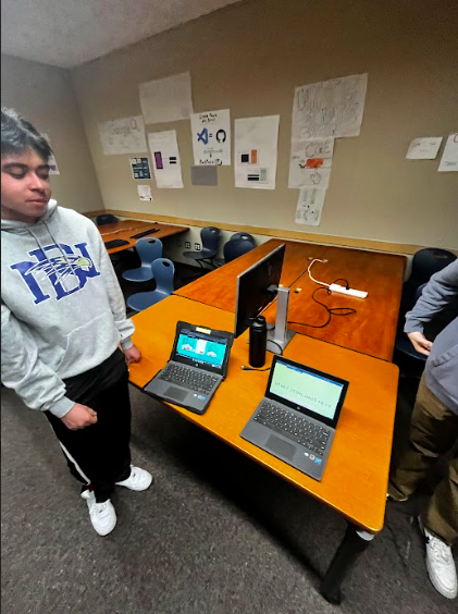
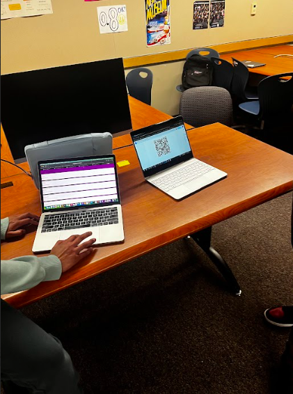
- The and project appeared engaging to many other N@tM attendees
- Site visuals and UI complemented to be efficient, sleek, and simple/easy to understand
- Recipe browsing/navigation was enjoyed quite a bit
- Explained the ideas of pulling data (API usage in simple, non CompSci/normally understandable terms) and populating the frontend with that information
- Grows
- The primary feedback we got was regarding our recipe browsing and communal aspect of sharing/uploading cooking-related comments
- Approximate question: “what’s the difference between just googling and browsing recipes on Google? Why does this site matter instead?”
- The solution proposed was to add more variety in our communal blogging feature
- Users should be able to upload/tag recipes to enhance the variety found in the communal aspect/blogging of the project to not only enhance that feature itself but also improve the site overall in encouraging more interactibility between our other features, primarily the recipe browsing
- The solution proposed was to add more variety in our communal blogging feature
- Approximate question: “what’s the difference between just googling and browsing recipes on Google? Why does this site matter instead?”
- Our rehearsed presentation work was a bit off, we could have presented more efficiently
- Better organization…
- Better flow would have been navigating through Home –> brief demo of Login/authentication –> feature by feature
- The primary feedback we got was regarding our recipe browsing and communal aspect of sharing/uploading cooking-related comments
Feature Feedback (Individual)
- My User Settings feature was boring
- Felt more like a side addition compared to how the other features were presented
- Feature too simple
- Feedback: add more complication, feature is a bit too bland
- Ex: add greater security by forcing users to enter Username, User ID, and Password before changing and saving theme
- Felt more like a side addition compared to how the other features were presented
General Blog on Event - N@tM 02/15/24
Student Projects - CompSci
Following our group’s presentation time, I saw a lot of cool things as I went through the CompSci room. The really impressive stuff, I thought, were the CSA projects (not surprising). Seeing the development of other projects at a level higher than mine genuinely got me more intrigued to not only the N@tM event compared to last Trimester, but also more invested into the CompSci possibilites here at Del Norte in general. A cool project I saw focused on browsing businesses and “investing” into them. Features involved being able to browse tons of different open businesses and “invest” in them (another cool aspect of this I hadn’t thought about too much in this class regarding the CPT project–there was a legal disclaimer that conveyed users wouldn’t actually be investing into businesses and it is more so a virtual demonstration of saving/providing input and output. Legal aspects are especially important in CompSci due to how much content is being distributed and reused/modified all the time: recalled my Legal & Ethical Concerns learning). This project was similar to our project in most respects, primarily just focusing on a different topic. And it was essentially an enhanced version of our project due to the similar feature concepts (ex: API-sourced browsing, navigate businesses by clicking on them, user data storing…), which impressed me in showing how much more complicated the things that we are currently doing in CSP can really get.


Student Projects - Outside CompSci
Overall, the Photography room took me back. I took Photography 1-2 in that same room freshman year and I essentially relived that time seeing others’ photos. I remember when I set up a gallery for my photos at the end of Trimester 1 and Trimester 2 during my first year at Del Norte. Photography still remains one of my passions, and although I did/could not spend much time at all outside of CompSci, one photo that stuck with me was a low exposure capture of a forest. The style reminded me of my own. I love photographing nature more than anything else and I love spending time in it. The light levels, foreground + background usage, and depth of field from the tree trunk on the right that helped frame the scene I just thought was really cool and it was generally just well done.
